Colour, Quiet Luxury and the Frameless Door
In contemporary luxury homes, colour does more than decorate — it sets the mood, clarifies the architecture and guides the eye. Nowhere is this more apparent than on a frameless door, where the absence of architraves and visible hardware places every emphasis on tone, sheen and material.
Quiet luxury thrives on restraint. Tonal palettes, subtle contrasts and refined finishes allow a frameless door to read as part of the wall plane, or as a deliberately nuanced surface within it.
Get the colour right and you achieve seamless continuity; get it wrong and the elevation feels busy, even when the detailing is minimal.
This guide explores frameless door colour schemes that complement modern interiors — from tone-on-tone neutrals to deep, saturated hues — and explains how light, sheen and substrate influence the final result.
If you’d like a quick refresher on how these systems work, see our overview of frameless doors.
Principles that Shape Colour on Frameless Doors
Continuity
For a truly seamless read, match the door colour to the wall so the elevation appears as a single plane. This works especially well with full-height leaves where there’s no transom line to break the surface.
Considered Contrast
If you want a hint of articulation, keep contrast subtle. Aim for a measured Light Reflectance Value (LRV) shift of around 10–15 between wall and door. The opening remains calm to the eye, but legibility is improved in use.
Sheen and Surface Texture
Sheen changes can shout louder than colour. Dead-matt or soft satin finishes feel refined; overly glossy paints introduce glare and reveal imperfections. Micro-texture lacquers help resist fingerprints and reduce “flashing” under raking light.
Shadow Gaps and Perimeter Lines
Consistent 2–3 mm shadow gaps frame the door with precision and influence how the colour reads. Tight, even reveals support minimalist schemes; irregular lines make tonal choices look off, even when the paint match is exact.
Substrate Matters
Colour behaves differently over varying substrates. A spray-finished door skin and adjacent plastered wall can reflect light differently despite sharing a code. Always test your chosen tone on the actual materials to confirm the match.
Palette Strategies for Contemporary Luxury Homes
Tone-on-Tone Neutrals
For true quiet luxury, keep the door and wall within the same tonal family. Soft whites, stone, greige and mushroom create calm, gallery-like elevations. On full-height leaves, a near-perfect match allows the opening to disappear while the architecture sets the rhythm.
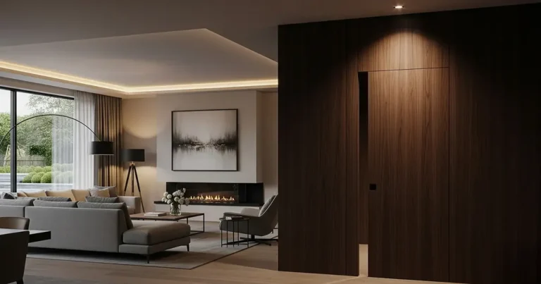
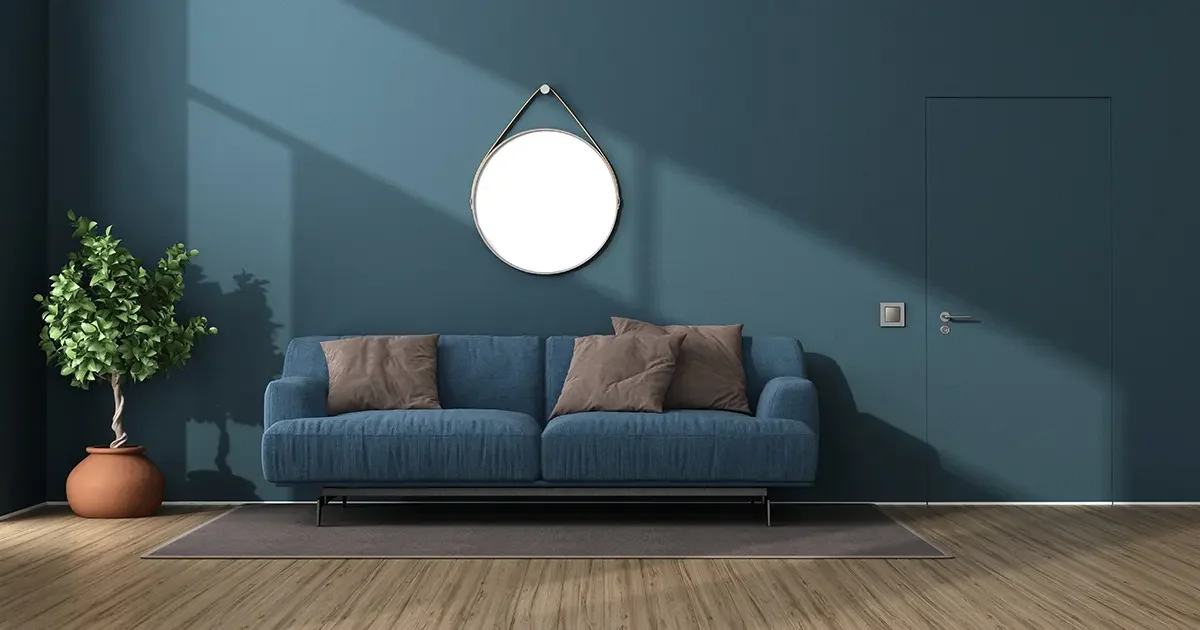
Deep, Saturated Hues
Charcoal, ink blue, bottle green or oxblood add discreet drama without visual noise. In well-lit rooms, these colours let a frameless door recede into a rich plane. Balance depth with lighter floors, pale upholstery or warm metal accents.
Warm Minimalism
Clay, putty, oatmeal and warm grey pair beautifully with natural stone and timber. The palette reads soft and architectural, ideal for bedrooms, dressing rooms and circulation spaces where serenity matters.
Cool Contemporary
Chalk, pale dove and mist grey deliver a crisp, modern edge. They sit comfortably alongside concrete, terrazzo, stainless steel and pale oak, keeping lines sharp without feeling clinical.
Material-Led Palettes
When the brief calls for texture, opt for veneered leaves—oak, walnut or smoked eucalyptus—toned to coordinate with adjacent joinery. Colour-washed timbers offer subtle figure without high contrast, and integrate seamlessly with bespoke panelling and cabinetry so the door reads as part of the elevation.
Room-by-Room Colour Ideas
Entrance Halls
Set a calm first impression with tone-on-tone neutrals. Colour-match full-height leaves to the wall so the threshold disappears and the architecture leads. A soft dead-matt finish reduces glare from sidelights or glazing.
Living Rooms and Open-Plan Spaces
Use near-identical wall and door colours to keep sightlines clean across zones. If you need subtle legibility, shift the door 10–15 LRV darker than the wall for a refined, barely-there contrast.
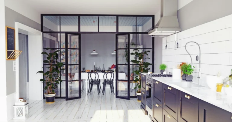
Kitchens and Hidden Pantries
Match the door to cabinet finishes for truly invisible access. In high-touch areas, micro-texture lacquers resist fingerprints and maintain a uniform sheen under task lighting.
Bedrooms and Dressing Rooms
For a hotel-calm feel, choose warm minimal tones—putty, mushroom, taupe—so doors blend with surrounding panelling. Deep hues (charcoal, bottle green) work well where you want a cocooning mood.
Corridors and Circulation
Full-height, wall-colour doors keep long elevations disciplined and gallery-like. Align shadow gaps and any panel breaks so rhythm comes from proportion rather than contrast.
Bathrooms and Spa Spaces
Favour soft satin or high-performance matt lacquers for better moisture resistance. Keep the colour close to adjacent wall finishes to avoid visual “chopping” in compact footprints.
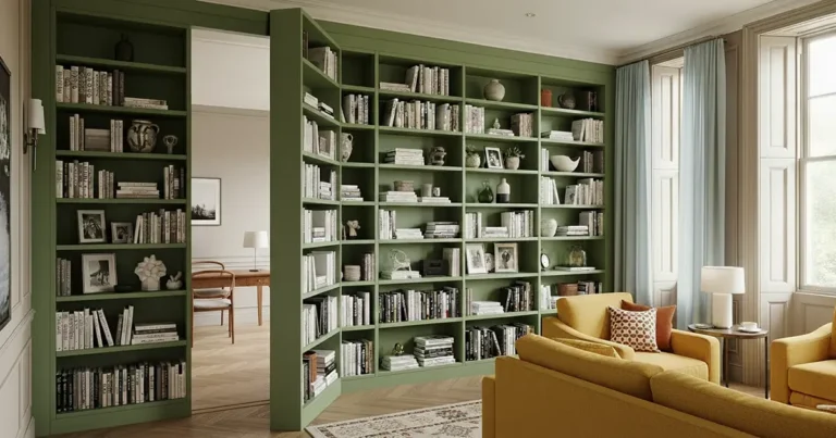
Home Offices and Libraries
Deeper, desaturated tones bring focus and quiet. A door that reads as part of the bookcase or wall system supports the room’s intent without adding visual noise.
Media Rooms
Low-reflectance colours—ink blue, oxblood, slate—minimise screen glare. Specify acoustic cores where needed and keep sheen levels consistently matte across the elevation.
Pairing Colour with Materials and Finishes
A frameless door reads as part of the elevation, so its colour must harmonise with adjacent materials. Think in ensembles rather than isolated swatches — stone, timber, metals and textiles should all support the same mood and temperature.
Stone and Porcelain
Match undertones, not names. Warm marbles and travertines favour putty, mushroom and stone-greys; cooler granites and terrazzo pair best with chalk, pale dove or mist. If the slab has bold veining, keep the door tone calm and close to the field colour.
Timber
For pale oaks and ash, soft greys and linens maintain a light, contemporary feel. With walnut, smoked oak or ebonised timbers, deeper tonals (charcoal, inky blues, bottle green) allow the grain to remain the hero without visual competition.
Metals
Bronze, brass and warm stainless harmonise with earthy neutrals and clay-based palettes; classic stainless and blackened steel prefer cooler greys and crisp whites. If metal detailing is minimal, let the door colour carry the warmth or coolness of the scheme.
Textiles
Bouclé, wool and linen absorb light and soften contrast. Choose door colours one step richer than the wall but within the same family to avoid a patchwork effect. In formal spaces, keep fabrics and door sheens similarly low-reflectance for a composed read.
Sheen Discipline
Sheen mismatches can be more jarring than colour shifts. Use dead-matt or soft satin on both wall and door skins to minimise glare and highlight form over finish. Reserve higher sheens for highly durable kick plates or wet zones only.
Accent Strategy
Introduce accent colours sparingly — a single muted terracotta, sage or oxblood can add depth, but keep the door within the primary palette so the elevation remains cohesive. If you need emphasis, adjust LRV by 10–15 rather than jumping hue families.
Edge and Junction Integrity
Maintain consistency at skirtings, architrave-free junctions and shadow gaps. A perfectly matched colour can still look “off” if trims, reveals or ceiling lines interrupt the plane. Plan the whole elevation before signing off the final tone.
Finish Systems and Application Quality
Factory Finish vs Site Paint
- Factory-sprayed lacquer delivers the most consistent colour and sheen across large, flat planes; it reduces orange peel, roller texture and flashing under raking light.
- On-site paint can work for small touch-ups, but full resprays in situ often introduce texture and sheen variations that break the “single plane” effect.
Colour Matching and Consistency
- Confirm colour by spray-out samples on the same substrate as the door skin (MDF/veneer) and compare under project lighting at different times of day.
- Agree RAL/NCS references, LRV targets and sheen (dead-matt or soft satin) in writing; avoid mixing sheens on one elevation.
- Beware metamerism: identical codes can read differently on plaster, timber and lacquer—test together before sign-off.
Edges, Returns and Junctions
- Specify wrapped returns and crisp edge radii so the colour “turns” the leaf without a visible line; avoid raw edges absorbing more pigment.
- Maintain clean shadow gaps (2–3 mm) and mask accurately so perimeter lines remain sharp and even.
- Coordinate skirting, recessed trims and ceiling junctions to prevent unintended contrast bands around the door plane.
Durability and Feel
- Choose catalysed or high-performance waterborne lacquers for abrasion, stain and UV resistance in circulation areas.
- Micro-texture matt finishes reduce fingerprints and glare while preserving a refined, architectural look.
- For veneered leaves, specify pore filling and sealing so colour and sheen remain even across figure and grain.
Application Environment and Process
- Control temperature and humidity during coating and cure to avoid bloom, sinkage or witness lines at joints.
- Remove or mask hardware correctly; prefinish components wherever possible to avoid site overspray and dust nibs.
- Implement a protection regime post-installation (edge guards, door socks, clean hands policy) so finishes remain pristine through the remainder of the build.
Quality Control
- Approve a benchmark sample for colour, sheen and texture; all subsequent doors should be checked against it under project lighting.
- Provide touch-up kits from the same batch for minor site corrections; avoid mixing brands or sheens for repairs.
Light, Orientation and Testing Colour
Colour is only ever as good as the light that hits it. On frameless doors—where surfaces read as one plane—daylight direction, artificial lighting and sheen levels can dramatically change how a tone appears across the elevation.
Understand Natural Light
- North-facing rooms – Cooler, steadier light. Colours read slightly greyer; warm neutrals and soft, red-shifted hues counterbalance the chill.
- South-facing rooms – Warmer, more intense light. Mid-tones appear brighter; consider stepping one shade darker to maintain composure at midday.
- East-facing rooms – Crisp morning light, flatter in the afternoon. Test tones at both times to avoid surprises.
- West-facing rooms – Neutral mornings, warm late-afternoon glow. Deep colours can bloom richly—confirm they don’t go muddy at dusk.
Specify Artificial Lighting with Care
- Colour temperature (K) – 2700–3000K reads warm and domestic; 3500–4000K is cleaner and more architectural. Keep the scheme consistent to avoid patchy colour perception across the door plane.
- CRI (Colour Rendering Index) – Aim for CRI 90+ so pigments render accurately. Low CRI can flatten sophisticated neutrals or push undertones off hue.
- Grazing vs washing – Raking light from wall washers will emphasise texture and any micro-variations in sheen. If the goal is a single, calm plane, opt for broader, softer washes.
Account for Surrounding Surfaces
- Floor bounce – Pale stone or timber will lift the perceived brightness of a door; dark floors absorb light and deepen the read.
- Adjacent finishes – Bold veining, metallics and pattern can cast subtle colour onto the leaf. Review the ensemble, not the door in isolation.
Test, Don’t Guess
- Large spray-outs – Approve colour on the actual substrate (MDF/veneer) at minimum A4 size; view vertically to mimic installed conditions.
- Sheen confirmation – Sign off dead-matt or soft satin under project lighting; confirm there’s no flashing under grazing light.
- Time-of-day checks – Assess samples morning, midday and evening. Metamerism can shift a “perfect” match by night.
- LRV discipline – If using considered contrast, keep the Light Reflectance Value delta tight (around 10–15) so the door remains calm within the elevation.
How to Specify – A Simple Workflow
- Define the brief — Capture the mood, materials and functional needs. Decide if the door should disappear (tone-on-tone) or read with a subtle contrast, and agree a target sheen (dead-matt or soft satin).
- Build a material palette — Assemble wall paint/veneer cards, floor samples, stone and metal finishes. Ensure undertones align so the door colour supports the whole elevation, not just the wall.
- Set LRV and sheen rules — If using contrast, aim for a controlled Light Reflectance Value delta (around 10–15). Keep sheen levels consistent across the elevation to avoid glare or patchy reads.
- Request samples — Commission large spray-outs on the correct substrate (MDF or veneer) and, where relevant, veneer layups toned to your palette. Review vertically under project lighting.
- Coordinate the build-up — Confirm wall construction, recessed frame type, hinge selection and shadow gap targets (typically 2–3 mm). Agree datum lines and ceiling levels for full-height doors.
- Mock-up and sign-off — Approve a benchmark sample for colour, sheen and texture. Check it against wall finishes and adjacent materials at different times of day to rule out metamerism.
- Document the specification — Issue written RAL/NCS references (or custom mix), sheen, substrate, edge detail, gap tolerances and protection requirements. Include lighting parameters (CCT and CRI) for final review.
- Finish and protect — Use factory-applied coatings wherever possible. Implement a protection regime post-install to keep edges and surfaces pristine through completion and snagging.
Common Pitfalls to Avoid
- Mixing sheens on one elevation — Even with a perfect colour match, differing gloss levels will read as patchy and distract from the seamless plane.
- Overly strong contrast — A large Light Reflectance Value jump makes the door shout. Keep contrasts controlled (around a 10–15 LRV delta) for calm legibility.
- No substrate-specific testing — The same code can read differently on lacquered MDF, veneer and plaster. Approve large spray-outs on the actual materials.
- Ignoring lighting conditions — Low CRI lamps or raking wall-washers can amplify texture and shift colour. Confirm tones under the final lighting scheme.
- Inconsistent shadow gaps — Uneven 2–3 mm reveals make even perfect colours look “off”. Set out and shim frames precisely, then fine-tune hinges.
- Poor edge and return detailing — Exposed edges absorb more pigment and telegraph a line. Specify wrapped returns and crisp radii to keep the plane continuous.
- Site paint as a primary finish — Roller texture and touch-ups break the single-plane effect. Use factory-sprayed finishes for main surfaces; reserve site work for minor corrections.
- Misaligned panelling rhythms — If the door sits within joinery, mismatched joints or grain direction will give the opening away. Align stiles, rails and veneer layups.
- Underspecified hardware — Concealed hinges must be rated for door size/weight; under-specification leads to sagging, binding and sheen burnishing at rub points.
- No protection plan post-install — Pristine finishes suffer during fit-out. Implement edge guards, clean-hands policy and dedicated protection until handover.
Colour that Reads as Architecture
On a frameless door, colour is not a decorative afterthought — it is part of the architecture. When tone, sheen and substrate are resolved together, the door disappears into the elevation or becomes a quietly expressive surface within it. The result is calm, cohesive and unmistakably high-end.
Whether you prefer tone-on-tone neutrality or rich, desaturated hues, the most successful schemes are disciplined: consistent sheens, controlled LRV shifts and finishes proven under project lighting. With a made-to-measure approach, these details are not compromises; they are the design.
If you’d like guidance, spray-out samples or specification support for an upcoming project, get in touch with our team. We’ll help you refine a palette that looks as seamless in use as it does on paper.